
In today’s digital landscape, responsive design is no longer optional, it's essential. With mobile traffic consistently outpacing desktop, businesses and developers must prioritize a mobile-first approach to meet user expectations and stay competitive.
At Plan D Studios, we champion mobile-first strategies as a foundation for building modern, high-performing digital experiences.
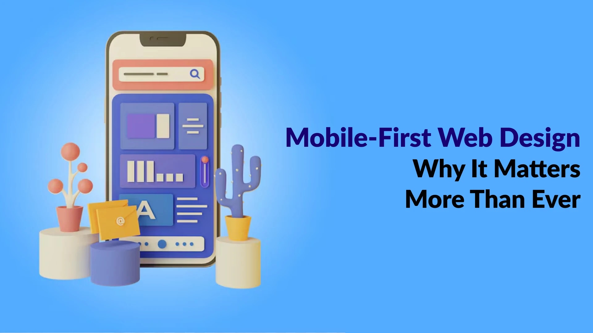
What Is Mobile-First Design?
The practice of designing for the smallest screen size (mobile) first, then gradually improving the experience for larger devices, such as tablets and PCs, is known as mobile-first design. This approach ensures the most critical content and features are accessible and functional on mobile devices before adding complexity for bigger screens.
Why Mobile-First Matters More Than Ever:
1. User Behavior Has Shifted:
Mobile devices account for more than 60% of all web traffic worldwide.
Users expect fast, intuitive experiences on their phones. If a site doesn’t load or function well on mobile, most users will leave immediately.
2. Google Prioritizes Mobile:
Since Google's mobile-first indexing rollout, the mobile version of your website is now the primary version Google uses to rank your content.
Poor mobile usability can directly hurt your SEO performance.
3. Faster Load Times:
Designing for mobile first encourages clean, minimal code and content prioritization.
This results in faster load times, which improve user experience and conversion rates.
4. Improved User Experience (UX):
Being mobile-first makes you consider what users actually care about.
It leads to a more focused, streamlined UX that translates well to all devices.
5. Easier Maintenance and Scalability:
Starting small and building up is more sustainable than trying to cram a complex desktop layout into a small screen.
It simplifies testing, updates, and scalability over time.
Key Best Practices for Mobile-First Design:
Make content a priority: Just the most important information should be shown, especially above the fold.
Use flexible grids and media queries: Build layouts that adapt gracefully to various screen sizes.
Optimize for performance: Compress images, minimize code, and reduce HTTP requests.
Touch-friendly design: Make sure the navigation and buttons are simple to tap.
Test on real devices: Emulators help, but real-world testing is crucial for quality assurance.
Plan D Studios:
Plan D Studios is a trusted IT company based in Islamabad, specializing in delivering customized digital solutions that drive business growth. With expertise in software development, website design, and digital marketing, they help businesses establish a strong online presence and achieve their goals. Their services are tailored to meet the unique needs of each client, ensuring innovative, high-performance solutions that enhance efficiency and engagement. Whether it's developing cutting-edge software, optimizing digital strategies, or creating user-friendly websites, Plan D Studios is committed to helping businesses succeed in the digital landscape. Visit Plan D Studios today and take the first step toward digital excellence.
Related Posts
UI/UX Design
Posted on 1 year ago
The Role of Design in Creating a Strong First Impression
In today’s digital-first world, your company’s design is more than just aesthetics; it's your handshake, your smile, and your pitch all rolled into one.

UI/UX Design
Posted on 1 year ago
The Power of Visual Identity: Why Graphic Design Matters More Than Ever
In a world saturated with content, your brand has just a few seconds to make a lasting impression.
UI/UX Design
Posted on 11 months ago
Responsive Design: Why Mobile-First Matters More Than Ever
In today’s digital landscape, responsive design is no longer optional, it's essential.

UI/UX Design
Posted on 7 months ago
Why Good Design Matters for Brand Identity
Discover why good design is crucial for building a strong brand identity that connects, communicates, and converts your audience effectively.
